Showing posts with label design is.... Show all posts

Friday, 15 August 2014

letterpress signage for Cultural Hotspots project

For it's inaugural year, an initiative called Cultural Hotspots will be featuring the south area of Scarborough by celebrating culture, art and community. I was invited by craft maven Kalpna Patel to participate in her window installation project "Please Come Again" which transforms an unconventional space and brings it to life through the lost art of visual merchandising and striking displays.
 

Say Yes and Ask Questions Later
If you aren't familiar with Kalpna's work, get to know it - it's inspiring. I was both honoured and scared straight when she asked if I would create an installation. I loved the idea of this gallery of storefronts coming to an area that hasn't ever been mined for art installations before. I'm always griping about living so far out east from the downtown core where all the cool stuff happens. So the opportunity to do something that I've never done (and have always wanted to), and the chance to work with an ace in her field, and bringing some craft to an area nearby are all the reasons why I jumped in with both feet. 
 

The Big Idea
The storefront that I was assigned to isn't really a store. It's the Crossroads Business Improvement Area office. What these folks essentially do is market, promote and revitalize businesses in the area, which in this case is between Victoria Park Avenue and Warden Avenue. Kalpna came up with the concept of creatively displaying names of businesses along that strip. It was a simple and effective idea that gave both purpose and meaning to its storefront.
 
The Process
As a letterpress artist, I was excited to execute the vision. For this project, I knew I had to get type that was larger than what I owned. It's not often that I get to work on things larger than 5x7", so this was a treat. I selected various fonts with serifs and a  gothic trade and sizes between an inch and a half to 3 inches in height for visual interest. The primary press used was the Morgan Line-O-Scribe flatbed which has a bed size of 14x22". For the smaller signs, I used the Mini Showcard press. This was all very fitting because these antique machines were originally used by small shop owners to print temporary point-of-sale signs. The business names that were printed were, for the most part, selected at random. Other names, Kalpna and I just really liked the sound of regardless of the business type and its current state of operation.
 
The Community Notice Board
The BIA asked if I could help address their promotional flyers situation. Up until the installation, they would tape announcements of events to their windows for passer-bys to read. But it looked plain, scattered and a little untidy. I decided to create a notice board disguised as another piece of storefront signage. It's simply a corkboard covered in felt and "Crossroads of the Danforth" hand-painted in a fashion reminiscent of old-school signage. The board is now prominently showcased with the dual purpose of either displaying the business name or a collection of flyers neatly arranged.

 
Big Ups
This project was a hell of a lot of fun to work on. I only have big hugs and thanks to give to Kalpna for trusting me to see it through. She was a huge help in the actual installation. I brought the supplies but she brought the know-how.
My hope is that people who come upon the window stop, look, read, wonder and smile. The display will be up for a month, so if you are in the area (or even if you're not), have a look-see and please do check out the other window installations created by fellow artists. Each of them are truly unique and a sight to behold!
...

Wednesday, 19 March 2014

tags + labels for TARO crochet


For a little over a month now, I've been hooked on crocheting.

It started with the desire to make myself a cowl. On the spur of the moment, while visiting my mom, I asked her to teach me how to crochet. She did, and the next thing I knew I was crocheting cowls for two straight weeks, probably one a day.

I'm delighted to say that I love doing it. I especially like using soft, wool-blend, thick and chunky yarn. And oh, the colours! I partly made so many cowls just to see them in so many different colours. Not only are they beautiful but they really do keep you warm. While I was knee-deep in cowl-making, the temperatures here in Toronto were unkind. Freezing rain, snow, and wind chills in the forecast made me giddy and looking forward to cowl-wearing weather!

In the midst of taking up this new-found interest, I started an Instagram account to document the goings-on of it all. And in doing that, I started to get orders for the cowls. And because of that, I decided to create a name for the work that I was making and designed and printed tags/labels to send out with the orders. It's been a whirlwind of making and I wouldn't have wanted it any other way.

The cowls are made to order and I'm still slowly adding more colours to line. And because of that, I'm taking the time to crochet rather than to set-up an online ordering system. For now, folks are ordering through the TARO Instagram feed and by emailing me at taromakes[at]gmail[dot]com.

//


Monday, 4 November 2013

cardboard play kitchen for Marcus


It all started with a simple search on Craigslist for a play kitchen for Marcus. He's very much into pretend play these days and I wanted to help him use his imagination as best I can. The play kitchens I found on CL were either too expensive, too large or too unsightly. Another search on the web lead me to a handful of sites which featured DIY play kitchens made out of cardboard! This was the perfect solution because I was looking for something temporary, inexpensive (or better, free), and customizable. Within the next hour, I was headed out the door on the hunt for cardboard boxes.

One trip to the grocery store, a few empty boxes from home and I had all of my building blocks. Good thing I'm a bit of hoarder when it comes to paper and craft supplies otherwise I wouldn't have been able to put the kitchen together so quickly and so easily.

STRUCTURE
I started by piecing the boxes together as the fridge, sink, stove and cupboard. After setting that up, I wrapped the boxes up in kraft and white newsprint paper for a unified look. The only exception to this was the fridge and sink where I cut the holes for the doors and sink before covering them.

FRIDGE
The fridge was made out of a diaper box which was just long and narrow enough. Rather than just drawing on the handles, I layered a couple of cardboard pieces together and wrapped them up and stuck them to the doors. And because the fridge sat a bit low on the ground I put it on top of another piece of cardboard box so that Marcus wouldn't have to bend down to use it.

SINK
For the surface area of the sink, I covered it with some left-over shelf liner, which coincidentally looks like granite. If there was anything that stumped be about this project, it was how I was going to make the faucet. Turns out, I just dug into Marcus' toy basket and started playing around with the wooden blocks until I got something that resembled a faucet and held the pieces together with Velcro and twine. I added a kitchen sink skirt to cover the existing hole with one of my favourite checkered fabrics. It actually doubles as an apron, but Marcus was moving too fast and too interested in other things to model it for us! I framed two pages of a thrifted book to add some fun and colour to the neutral palate and stuck them to the 'backsplash'.

STOVE/OVEN
A bankers box laid on it's backside makes an ideal stove and oven because the lid opens (or falls) just like an oven door. We put in a cardboard shelf to act as a rack. I used a toilet paper roll cut in half as the oven door handle. The knobs were made from individual bottom sides of an egg carton and glued to cardboard. The stove elements were made of cardboard as well, with string tied around them for texture. At first, I thought I was going to add a clock to the stove but decided that a colourful graphic element would like nice. And so it turned out to be a rectangular shape covered with origami paper.

SHELF/CUPBOARD
The shelf is pretty self-explanatory. Not much going on with that piece except that I was happy to line the shelves with vintage ledger paper. And the cupboard beneath the shelf, has a nifty panel detail made of cardboard on the doors.

COST/PROPS/TIME
The accessories were my only expense for the play kitchen. For under $3, I got a couple of enamel cups, a woven basket and a mini baking tin. The rest of the props I already had or got from my mom's kitchen! The kitchen took me four nights to put together. After Marcus was down for the evening, I had set to work for a few hours and then hid the boxes away in another room so that he wouldn't find them until the big reveal.

RESULTS
Marcus was intrigued by his new kitchen. He touched all of the handles and knobs, took out the plates, cups and utensils and put them back in their places and also found new places for them to sit. He opened and closed the doors. He even made swishing noises while washing the dishes and his hands in the sink. He 'drank' from cups and 'ate' from the bowls.

UNEXPECTED
He pretended that the freezer door of the fridge was a microwave. "Beep, beep, beep...".

This was such a fun project to put together. I got to channel my inner-kid and couldn't help but create a space that I wouldn't mind cooking in too.

//


Thursday, 19 September 2013

new to the shop: gothic in gold

We're knee deep into September and it's always a weird time for stationers. It's not close to the holidays but we're already thinking about it and brewing up festive designs. So, to give myself a break and some breathing room before Christmas arrives, I've created a new small line of cards for the interim! 

These are the Gold in Gothic correspondence cards featuring my beloved gothic wood type and the newly acquired, News Gothic Condensed type. There were inked in gold and printed on the mini Showcard press. You'll also notice the new suave black and pink blush cardstock! 

These darlings are only available for wholesale orders. If you'd like to place an order (15 cards minimum per style) please contact me at 'snapandtumbleletterpress@gmail.com'. 

//

Wednesday, 7 August 2013

stationery for tassie


A few weeks ago I had the pleasure of working with Toronto screenwriter and producer, Tassie Cameron, on her new stationery. When we met to talk about what she was looking for I immediately clicked with her because she's just the sweetest person and she mentioned the words "simple design and typography". She's a woman after my own heart. As you can see we came up with an identity that is clean, elegant and classic. Included in the suite is a folded note, flat card, business card and return addressed envelope.

I've said it before and it's worth mentioning again...I get to collaborate with, design and print for the best clients.

//

Monday, 3 June 2013

totem cards


to·tem (noun)
Anything serving as a distinctive, often venerated, emblem or symbol.
 
There is something about this starburst shape that I love and can't seem to stop printing with. I once saw it referred to as a Slocum seal but haven't since found any more information about it. It's become my favorite go to piece when I'm printing on the Showcard press. Maybe it has something to do with how large the block is and how satisfying it is to roll an inked brayer over it. And no matter what colour it lays down, it always looks so, so good. Is it just me or do you also have something similar that you like to see in print? Is there something you have an affinity for and keep printing, drawing or painting?
 
// 

Monday, 22 April 2013

linoleum block on the lino-o-scribe


Over the last couple of weeks I was able to try out my first linoleum carving with the lino-o-scribe. Before I started I was so afraid that it wasn't going to work for some reason. But I gathered up my materials anyway and hoped for the best. I got some really helpful hints from Kinga, who also owns a Morgan Line-O-Scribe, on which type of linoleum she uses and how to set it up in the bed so that it's about type-high.

My first step was to decide on the size of linoleum I wanted. That was the easy part. Because the press bed is 14x22", I wanted to go as big as I could. The largest block I could find at my local art supplies store was 12x18" which was perfect because I sourced some cardstock at the same size. 

Next was trying to figure out what design I wanted to see printed. But I also had to think about 1.) what I could easily carve out and 2.) something that wouldn't take me too long do. I decided on hand-drawing a series of narrow hexagon shapes with various widths of lines on the inside of each. This was a good first-time design because there was just enough carving that I didn't get tired of doing it and that I got to use a couple of the carving blades. All of the straight lines made the carving go nice and smoothly too! Also, there's a nice balance between the negative and positive space. I wanted to carve as little of the lino off to make the best use of it's size. By keeping the design large, I was also able to see if there were any problematic, low or weak spots with the press and ink rollers.

After finally getting the lino to the height that the ink rollers could make contact with it, I was ready to test the block out. I was happily surprised with the result but as expected, I had some more carving to do at the top and bottom edges of the negative space to have it completely free of an impression.

As you can see in the photos of the prints, there is some variation with the ink coverage. I actually don't mind that. This design would look very different if the colour was completely solid throughout.

All in all, I am very happy with my first experiment with the line-o-scribe and a lino block. The press is in fantastic condition as are the rollers. I see myself doing many more of these lino carvings!

//


Monday, 1 April 2013

business cards for danica samuel


It's just too nice that I get to print business cards design by Christian Bortey for the 
ever-so-lovely Danica Samuel.

//

Tuesday, 12 March 2013

colour blocks 1

Sometimes I just want to see what a few colours would look like together in print. Playing with these wood block punctuation marks on the Showcard press lets me do just that, quickly and easily. Because I'm not using type for these experiements, it's easy for me to simply focus on the colours and see nothing else other than that. Also by using the punctuation marks, which are basically rectangular in shape, I decided to casually put them together and was always happily met with the final result. The random arrangement of the shapes, patterns, colours and overlays is a nice way to break away from other projects and type-related matter. I'm hoping to create a few more works of these mini-wall-art prints with different colour ways.

//


Thursday, 10 January 2013

i heart stationery


This is a long overdue post! A big thank you to Charlotte Rivers who invited me to contribute to her latest book, I Heart Stationery. I totally dig this book because it's chock full of paper-goods eye candy and it focuses on techniques and materials from various artists world-wide. Definitely a good and inspirational resource to have on my shelf and it makes a nice gift for that paperphile in your life.

//


Wednesday, 8 August 2012

business cards for aprile


When Aprile approached me to help print her business cards, I couldn't wait to get started. Her design called for a warm grey on 600gsm cardstock, double-sided. The fine lines made some nice, distinct impressions. It's so satisfying to see (and feel) those textures. I had to hold back a little on the lever otherwise there surely would've been some bruising, or worse yet, some tearing in the cardstock because they were so thick. I'm always up for printing designs that aren't the norm, in this case, for business cards. Recipients of these cards are sure not to forget Aprile and her beautiful work.

Monday, 14 November 2011

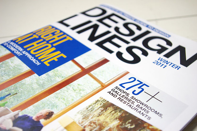
design lines


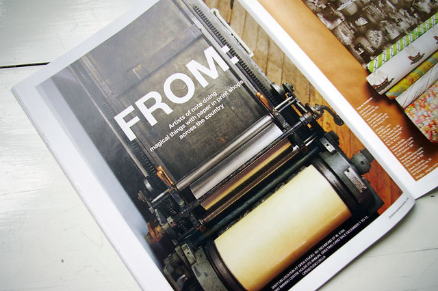
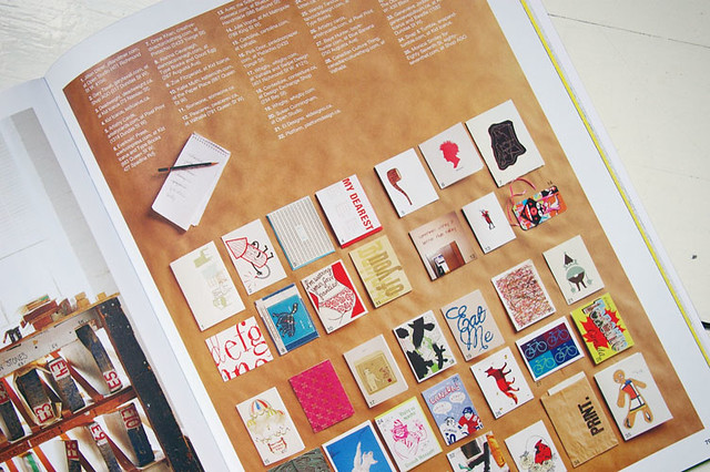
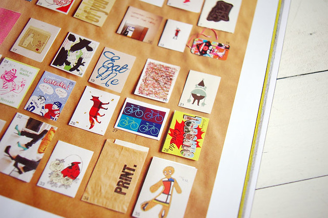
A big thank you to Design Lines for inviting me to be a part of their 2011 Winter Issue stationery feature! The layout and photography are simply beautiful. I'm chuffed that the Print bags are among the chosen! Included in the round up are some of my favorite local artists - Send More Mail, Deadweight, and Kid Icarus.

//