Showing posts with label stationery. Show all posts

Monday, 21 October 2013

it's here! letterpress holiday card workshops


I'm so excited to announce the opening of Snap + Tumble's first letterpress holiday card workshop! For those of you who like to get a jump on the season, these workshops will be held in November which leaves plenty of time to write and post your handmade greetings. There will be a selection of seven festive designs to choose from and to print with on the Mini Showcard Proof press. Participants will take home 15 letterpress printed cards to send and share with friends and loved ones. Also included, will be two vintage stamp packs by Send More Mail. These sweet stamps are holiday themed and are enough to send two standard sized letters within Canada. Visit the Snap + Tumble website for more information, dates and registration details!

//

Monday, 14 October 2013

black + tan collection


A new collection of correspondence cards from Snap + Tumble. 
These were printed in a black and tan colour, just fit for autumn! 
Happy Thanksgiving, my fellow Canadian friends!

//


Thursday, 19 September 2013

new to the shop: gothic in gold

We're knee deep into September and it's always a weird time for stationers. It's not close to the holidays but we're already thinking about it and brewing up festive designs. So, to give myself a break and some breathing room before Christmas arrives, I've created a new small line of cards for the interim! 

These are the Gold in Gothic correspondence cards featuring my beloved gothic wood type and the newly acquired, News Gothic Condensed type. There were inked in gold and printed on the mini Showcard press. You'll also notice the new suave black and pink blush cardstock! 

These darlings are only available for wholesale orders. If you'd like to place an order (15 cards minimum per style) please contact me at 'snapandtumbleletterpress@gmail.com'. 

//

Tuesday, 3 September 2013

birth announcements for alice


Laurence and Maxim contacted me from across the pond (all the way over in Belgium!) to help them create birth announcements for their little girl, Alice. We bounced around a few ideas and colour ways but ultimately decided on a very simple and elegant design. The main element of this announcement is Alice's initial which is an art deco font paired with a custom made ornament. This creates a single monogram and was printed in gold along with Alice's middle Thai name. The remainder of the text and the baby-in-the-carriage silhouette was printed in black. I am always so honoured when asked to print keepsakes for special occasions, and these announcements were no exception. Congratulations to the proud parents, Laurence and Maxim!

//


Wednesday, 7 August 2013

stationery for tassie


A few weeks ago I had the pleasure of working with Toronto screenwriter and producer, Tassie Cameron, on her new stationery. When we met to talk about what she was looking for I immediately clicked with her because she's just the sweetest person and she mentioned the words "simple design and typography". She's a woman after my own heart. As you can see we came up with an identity that is clean, elegant and classic. Included in the suite is a folded note, flat card, business card and return addressed envelope.

I've said it before and it's worth mentioning again...I get to collaborate with, design and print for the best clients.

//

Wednesday, 31 July 2013


Dear friends, 

Snap + Tumble will have a table at the second Parkdale Flea! The weather forecast looks good, so if you're in the hood, swing by and say hello. There will be antiques, collectibles, food and beverage vendors and local craft-folk. It would be lovely to see you there!

Sunday August 4th, 2013
1266 Queen Street West
10am-5pm
no entry fee!

//

Tuesday, 30 July 2013

new address postcards for angela

One of my oldest and dearest friends has recently become a homeowner and I couldn't be happier for her. She asked if I could design and print her new address postcards and I didn't wait to get started. Her new space is in the historic Tip Top Tailors building which was converted from the warehouse and offices of the Toronto clothing retailer. I knew I wanted to print the building because, well, just look at it...it's an art deco beauty! I kept the signage in its signature red and used an art deco style font for the back of the postcards. Clean, neat, and simple. I think these moving announcements are the cat's meow :) 

Congratulations, Angela! Can't wait to see the place!

//

Monday, 1 April 2013

business cards for danica samuel


It's just too nice that I get to print business cards design by Christian Bortey for the 
ever-so-lovely Danica Samuel.

//

Wednesday, 27 March 2013


As we live a life of ease
Every one of us has all we need 
Sky of blue and sea of green
In our yellow submarine 

- The Beatles


 Sometimes you just have to print a yellow submarine card.

//

Friday, 27 July 2012


It was a good day at the thrift store. As soon as my eyes locked on the kitchy vintage patterns of these albums, they were mine. Then I read the words "Post Cards" and squealed. What a great idea. An album that holds postcards...why hadn't I seen anything like this before? I brought these beauties home, unravelled my sad, messy bundles of snail mail and sorted through the ones that I could fit in the 4 x 6" pockets. Both albums have eight sleeves with six pockets that can hold 96 pieces of small mail. So good. Now, I'm encouraged to look back at all my lovely mail whereas before I just kept them in tied up stacks, hidden away in a box. Best second-hand store score. Ever.

//


Thursday, 7 June 2012

modern ornaments


My newest folded 4BAR prints will be making their debut this Sunday at The Junction Flea! I've had these designs for a while (over a year) and was waiting for the right time to print them together. These are the Ornaments Collection and include the plaid, chevron, arrows, feather and crosshatch.

I've been keeping an eye on the forecast for the weekend and it's calling for straight up sunny skies for the outdoor market!

//

Friday, 10 February 2012

my cupid


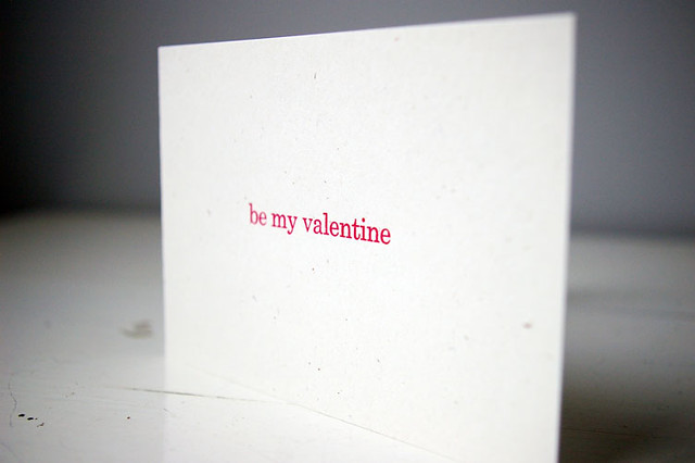
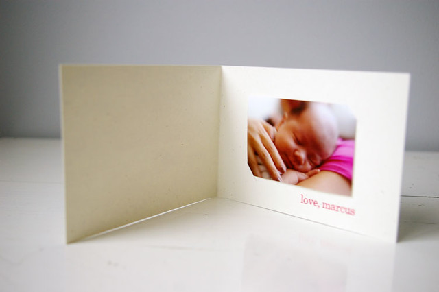
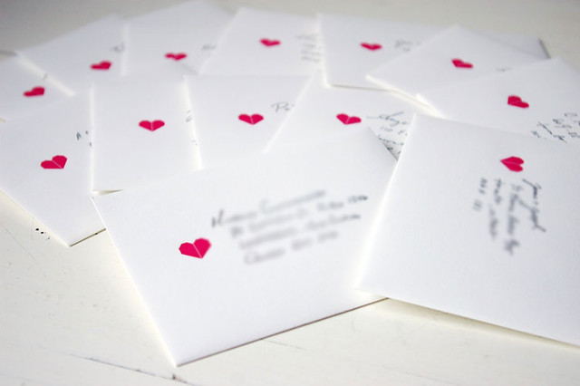
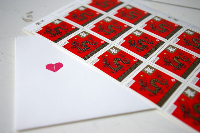
When he was born, I had high hopes of designing and printing birth announcements for Marcus. But, really, what was I thinking? Any "spare" moment I had, I slept. Or ate. Or did laundry. Once things settled down, I started to think about announcements again and decided that it was too late for those. When this month rolled around, I thought Valentine's would be the perfect time for Marcus to introduce himself to our family and friends. So, when I had the energy and Marcus was sound asleep, I quickly handset a short greeting, set up the Adana, lay down some ink already mixed from a previous project and printed away. It felt really (really) good to get back on the press, even for a short time. I had enough sense to print these well before February 14th so that I could hand-finish them with slits to insert a wallet-size photo, handwrite short notes, stamp and send them off.

The sweet photo of Marcus was taken by the fabulous Ingrid. It was his first official photo shoot and three weeks old and he slept right through it. My sleepy Valentine.

//

Tuesday, 6 December 2011

ogilvy quoted


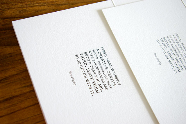
These were designed and printed for Ingrid to send out to her friends and clients for the holidays. Sometimes I think that I should just print every project in black ink. It just goes down so crisp and clean. The festive red envelopes are a perfect match for the occasion. See Ingrid's cards from last year.

//