Showing posts with label calling cards. Show all posts

Monday, 1 April 2013

business cards for danica samuel


It's just too nice that I get to print business cards design by Christian Bortey for the 
ever-so-lovely Danica Samuel.

//

Wednesday, 8 August 2012

business cards for aprile


When Aprile approached me to help print her business cards, I couldn't wait to get started. Her design called for a warm grey on 600gsm cardstock, double-sided. The fine lines made some nice, distinct impressions. It's so satisfying to see (and feel) those textures. I had to hold back a little on the lever otherwise there surely would've been some bruising, or worse yet, some tearing in the cardstock because they were so thick. I'm always up for printing designs that aren't the norm, in this case, for business cards. Recipients of these cards are sure not to forget Aprile and her beautiful work.

Monday, 30 July 2012


Super thick cards for a super duper friend who's birthday happens to be today :)

//


Friday, 29 June 2012


I always get unreasonably excited about printing simple and elegant designs. Dark grey, complementary fonts on soft white cardstock. Nothing more, nothing less. Nice.

//

Wednesday, 4 January 2012

business cards for chris


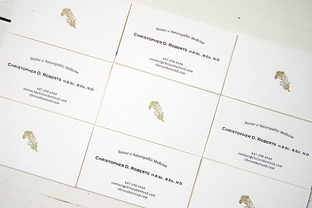
Double-sided, black and gold ink, super thick soft white cardstock. 


//

Thursday, 22 September 2011

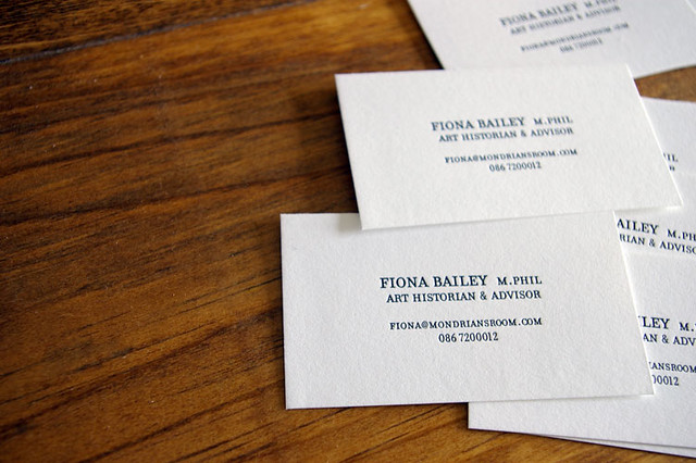
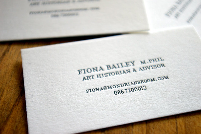
business cards for fiona


These were shipped all the way across the Atlantic to Dublin, Ireland!

PS. I love printing with black ink but it's one of the toughest to clean up.

//

Wednesday, 6 April 2011

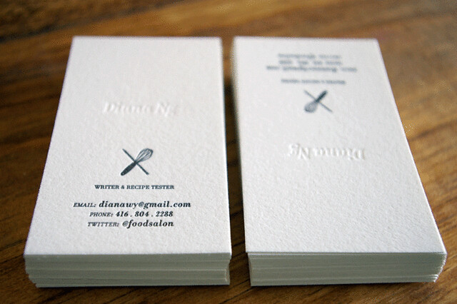
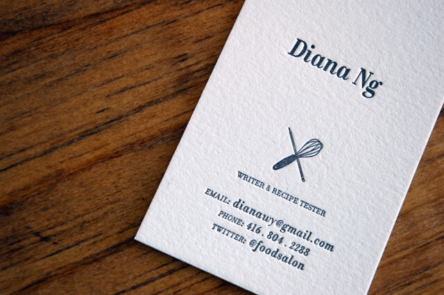
business cards for diana


Diana and I worked together many moons ago and I was delighted to reconnect when she contacted me about her business cards. She is (and always has been) a savvy gal with a knack for good writing. Combine that with Diana's knowledge and love of food and you get a writer/recipe tester! How cool is that title anyway, 'recipe tester'?

Other than some specifics on paper and colour, Diana gave me free reign to design her business cards. Bless her for that. I had a lot of fun coming up with a number of layouts and logos. We ultimately fell in love with this one. A little bit classic, a little bit old-school, and a little bit understated.
 
//

Tuesday, 29 March 2011

business cards for jessica


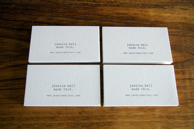
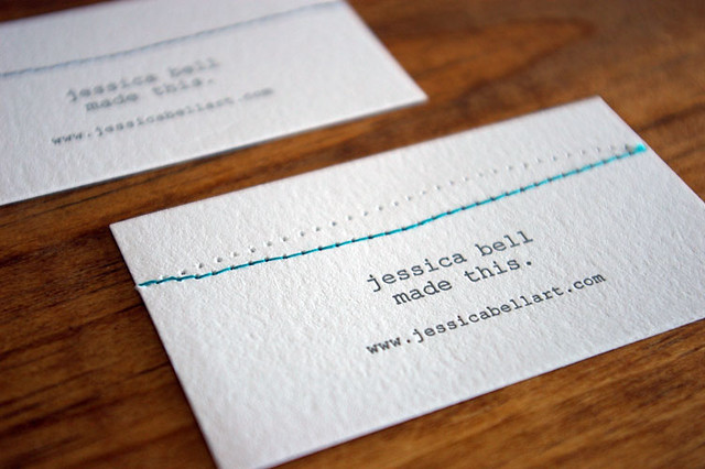
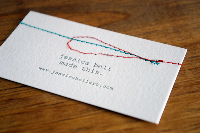
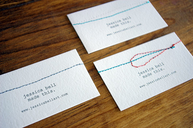
I had the pleasure of working with Jessica on her business cards recently. I'm a big fan of her work and so was naturally excited when she contacted me with the idea of embellishing the cards in addition to letterpress printing them. She kindly sent back a few of them after she hand-finished them, each one different from the other. I love the finished pieces.

Jessica Bell's blog here, work here, bigcartel shop here. Check it!

//

Thursday, 30 December 2010

business cards for blair


One more custom print job before 2010 is out!

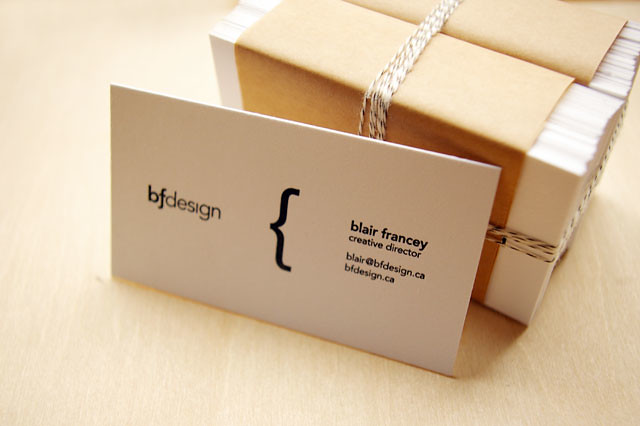
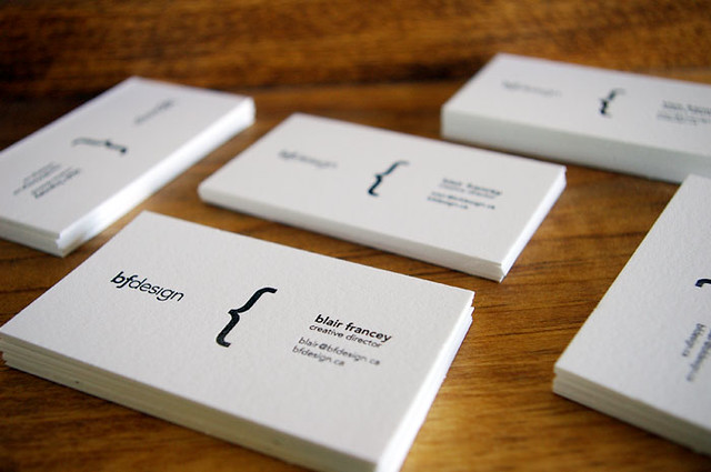
These business cards were designed by Creative Director Blair Francey as part of his rebranding strategy. They're printed on 100% cotton thick cardstock in Fluorescent White. It was a pleasure to work with Blair. Not only because he's just such a nice guy, but also because he was open to changing his original design which wasn't as easily applicable to letterpress printing. The final results of his business card are simple, elegant and highlights the best of letterpress.

All the very best to Blair and his new adventures in the UK!

//

Tuesday, 8 December 2009


7/8 pt Pantone Black + 1/6 pt Pantone Rubine Red + 64 pts Pantone Transparent White = Pantone 406 U

4hrs = 150 calling cards
and still going...

Thursday, 10 September 2009

move over mr. ocean


What says cool more than an old-school calling card?

A few weeks back Lila contacted me about printing a set for her partner as a gift for his birthday. When she talked about what they should look like, it included a description of Danny Ocean's cards from Ocean's Eleven. Naturally, I got excited about the retro theme. More often than not, these lean types of designs pack more punch than ornate ones. No phone number, no title, no email. Just a name in upper case Copperplate and a border. Boy, do these cards make me want to be a part of the Rat Pack!

Wednesday, 15 July 2009

let's revive the calling card

I'm all for taking on projects that are a little off of centre. So when Ted approached me with his, I was thrilled. Our initial conversations led me to believe that I'd be printing business cards for him. But when he presented his own design, I realized it was more of a calling card. No phone number, no address, no website. How refreshing! In an age of frenzied online social networking, it was a treat to contribute to the slow, old fashioned way of doing things. The Art of Manliness' post on the historical use of calling cards is a great read that just might make you want to order a set of your own.

Sunday, 19 April 2009

the sweet jar


I'm liking the candy pink colour on Pearl White Lettra.
Still, I couldn't help but blind deboss a few cards and marvel at naked letterpress magic.
Is it odd that I don't have the snap&tumble wordmark on my own calling cards?
If it is, that's okay by me.