
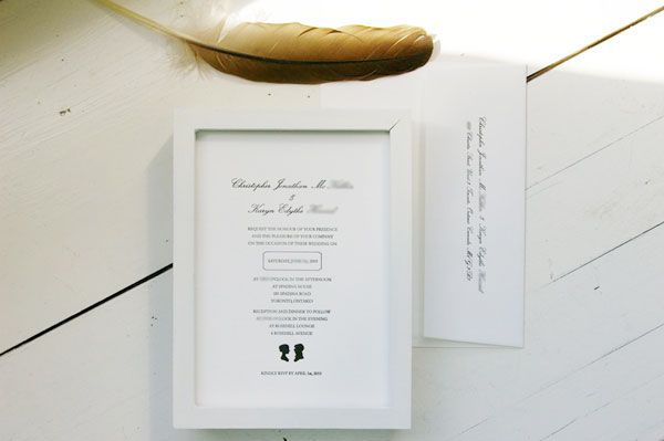
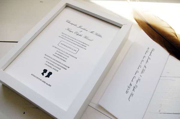
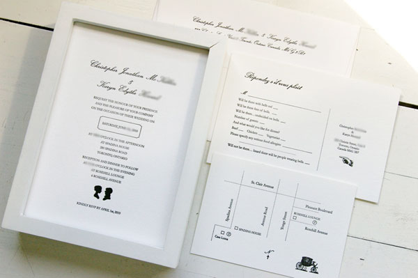
5x7 flat invitation | printed envelope | RSVP postcard | map flat card | one colour run | Crane Pearl White Lettra 110 lbs
It was such a pleasure to work with Karyn and Chris on their wedding invitations. They were one of the most laid back and fun-loving couples I've ever met.
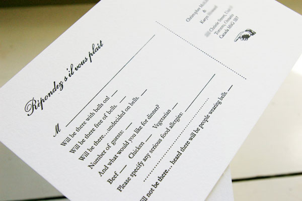
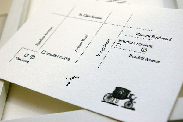
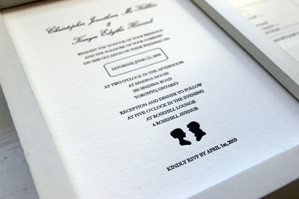
In one of our early email correspondences, Karyn mentioned that one of the things she needed have in her suite was the 'pointing finger' image. I've always liked that motif and couldn't wait to use it for their RSVP postcards. The entire theme was a throwback to the old world and called for similar images. A classic colour combo of black and white lets us show off the printing method that is unmistakeably letterpress.
Congratulations to Karyn and Chris and thank you for letting snap & tumble be a part of your special day!


7 comments:
these are so pretty tanya!
They're beautiful!
I LOVE these invitations, the bells, the wagon, everything, awesome
Thank you, ladies!
Nice work Tanya! The B+W is simply lovely ;)
jax: thank you!
just gorgeous! I too, love the "hand symbol" and would use it every chance I get! The little carriage symbol is also fantastic. I just love the detail work. Beautiful!
Post a Comment
Anonymous comments (meaning comments without valid URL's) will not be published.