photos above taken by: Bryonie W.
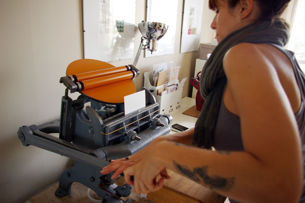
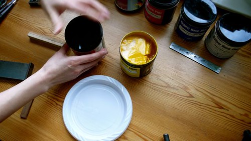
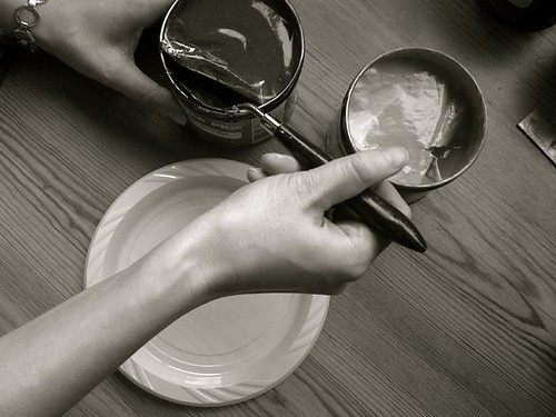
It's not often (at all) that I'll use orange in any of my prints. Not because I don't like the colour. But I prefer to mix blues, whites, and neutrals. Red is another colour that I'll unlikely print with. My yellow and red inks, for some reason, tend to dry alot slower than the rest of my inks. And though I use rubber base inks, the yellow and reds (if I don't use enough) still seem transparent. Is it just my set of inks or yours too?
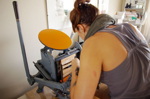
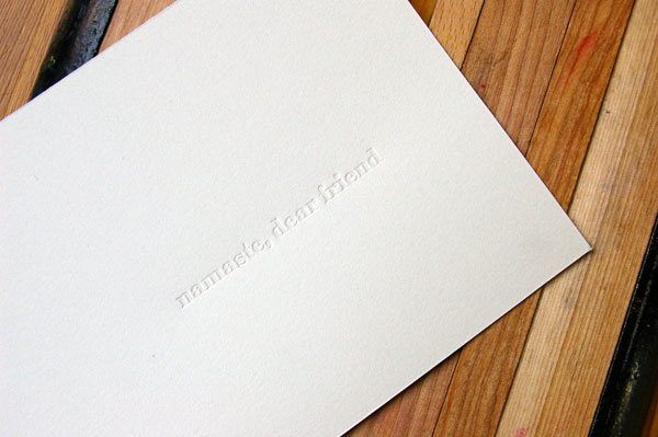
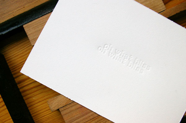
I was happy to see a change of colour on the ink disc when Letterpress Curiosity Workshop participant, Bryonie, chose orange to print her work with. It was quite fitting with the rays of sunshine Toronto had all of last week!
I was happy to see a change of colour on the ink disc when Letterpress Curiosity Workshop participant, Bryonie, chose orange to print her work with. It was quite fitting with the rays of sunshine Toronto had all of last week!




2 comments:
I don't tend to use reds either but I do like orange, I have one called tigerlilly which is sweet (but in your face ;). Do you use Opaque or transparent white to mix, I heard some people use a bit of both to help with the transparency. My transparent white is very runny!
jax: i use opaque white which helps thicken the consistency and the transparency. i rarely ever use my transparent white.
Post a Comment
Anonymous comments (meaning comments without valid URL's) will not be published.